Everybody knows how important a website is to a business. It's the first thing a potential client checks out about your brand.
But did you know that a bad website can turn off people and even have negative sentiments about your brand?
With the mounting number of competitors in the market, this is something that you cannot afford to overlook.
What is a "bad website" and how can you take steps to make sure yours isn't going to be one? Don't fret, we can help with that!
We've highlighted more than a few important pointers when it comes to bad web design and execution.
Here Are the Key Ways Bad Web Design Impacts Your Bottom Line
1. Slow Loading Web Pages
The biggest sin when it comes to website design is usually the slower loading of pages. And this is not just a design choice, but reinforced by search engine algorithms as well.
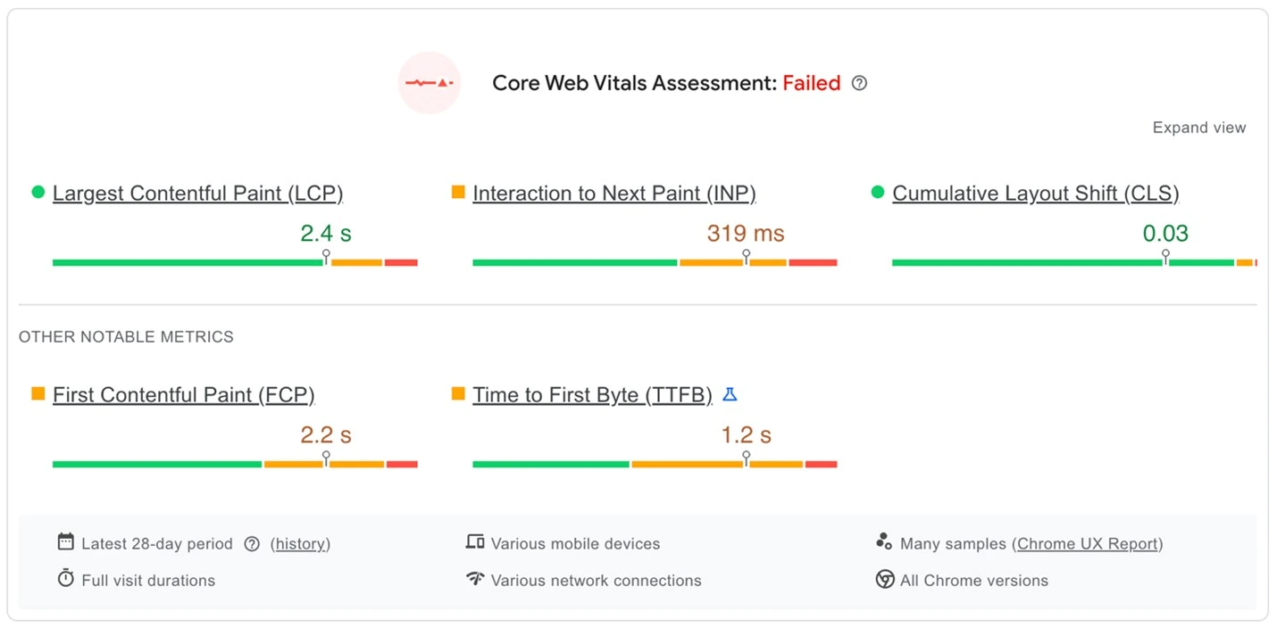
According to Google, one of the biggest negatives your website can have today is loading slowly. It affects your rankings considerably and can have a lasting impact on your website's usability.
Pages that load slowly tend to have a higher-than-average bounce rate. Bounce rate is another negative ranking signal that you need to take seriously.
There are several solutions that you can implement to help you with this. The first thing you need to do is compress your images and take down autoplaying videos.
These can consume a lot of needless bandwidth when loading. Using a Content Delivery Network along with effective caching can also bring your load speed down.
2. Poor Mobile Responsiveness
While loading speed is a prime ranking signal, mobile responsiveness comes a close second.
The mobile responsiveness property of a website defines how well it can adapt to different devices and screen sizes.
With more than 60% of all internet traffic being mobile devices, search engines have begun penalizing websites with poor mobile compatibility.
And we really can't blame Google here because it's a pain for users too. Lack of mobile responsiveness results in pages that either look too small or big for the users.
Frustrated users end up leaving immediately which results in sky-high bounce rates. The way you can counteract this is by resorting to a mobile-first approach.
Start with a layout that offers mobile responsiveness right from the start. There are responsive frameworks like Bootstrap that can help you optimize these aspects of your website.
3. Bad Typography and Readability
From the perspective of a user, one of the most frustrating things they can encounter is a website with bad typography.
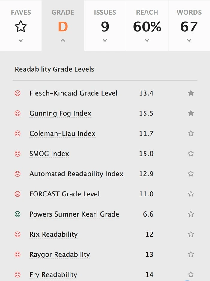
It can make text on the website incredibly hard to read which can cause eye strain and fatigue. Users are not going to engage with your website or content.
Poor font choice results in bad scalability which means anything you write is just not going to reach your users.
In really bad scenarios, this can lead to a loss of faith in your brand and lower credibility in your niche. The way to solve this is simple - use popular fonts like sans-serif or calibri for a majority of your content.
These are the most used fonts for a reason! Remember to break up longer paragraphs with the use of appropriate subheadings and bullet points.
4. Choice of Poor Color Schemes
Like the choice of fonts, website themes also play a pivotal role when it comes to engaging your potential users.
Choosing the wrong colors can cause distraction and discomfort leading to people clicking away from your website in frustration.
You should pay attention to the choice of font colors because low-contrast themes can make it incredibly hard to read.
All these result in negative emotions towards your brand that you just don't need especially in a competitive environment.
Bad color choices can also lead to people entirely missing your CTA text leaving you high and dry when it comes to conversions and landing page traffic.
The solution to this is to decide on a usable brand color palette and then stick to it throughout. Fixing the color palette should be done in discussion with the design team in your organization.
Don't use overly bright and clashing color themes that can cause eye strain.
5. Confusing Website Navigation
Navigation plays a hugely important role when it comes to website usability. Users who are unable to find key pages on your website are likely to leave it for your competitors.
Not having the navigation elements well laid out can result in high bounce rates and user frustration. If you don't get the flow of your website right, you will have to deal with lower time-on-site from users.
What's more, this problem can lead to SEO issues where you'll find your metrics just don't improve over time. In the worst cases, you'll find users belittling your brand due to bad UX on social media.
The key to getting the navigation right is to keep everything simple. Don't overload users with information, have 5 to 7 elements on the top navigation band.
Implement breadcrumbs on your website for easier navigation. Have a proper search function that is both comprehensive and intelligent.
6. Outdated Design Themes
Outdated design themes are the worst flaws to have on a website. A website that looks like it's from the 90s can have a huge negative impact on your business.
It results in a loss of trust in your brand and people leaving it in droves. Outdated themes can result in poor compatibility with modern browsers and mobile devices.
They will not have responsive themes which is automatically a huge red flag as far as search engines are concerned. These themes will also have serious security risks which can put other computers in danger.
It should also be noted that modern antivirus software does not let users browse websites that have security vulnerabilities.
Replace this outdated theme with something modern and effective. Migration is easy in modern CMS platforms like WordPress, all you need to do is hit one button.
7. Mediocre CTAs and Anchors
Many people underestimate the importance of call-to-action text, but you never should. CTAs are what can direct users to take an action that you want.
This could be anything from signing up for your newsletter to navigating to a landing page. This CTA should be visible to the user so they can act on it.
But in the case of poorly designed websites, this is not the case. CTAs will be improperly placed or have color themes that make visibility hard.
Bad CTAs also waste your paid ads by generating no leads with your click-throughs. Ensure that your CTAs are worded with urgency and they're placed at optimal spots on your website.
Your CTA text or button should stand out from the rest of the website so users are encouraged to take action.
8. Cluttered Design Layouts
An overlooked web design flaw in a lot of cases has been cluttered design layouts. When you're creating your branded website, there are chances you won't realize how cluttered your website is.
Unless you have professional web designers, this is something that you can't identify by yourself.
This usually happens when you're "too close" to your brand, making a third-party assessment difficult for you. When users are overwhelmed by a cluttered website, they're simply going to leave.
They are not going to stick around and search for the content they want on your website. This makes the hundreds and thousands of dollars spent on design, content, and marketing irrelevant.
When designing a modern website, always ensure there's enough space between various elements. Give enough priority to content so it is easily scannable by your users.
Never have pop-ups on your websites, especially right in the middle of the screen, unless they're really important.
9. Lack of Visual Hierarchy
An important part of UI/UX design is the focus on visual hierarchy for optimal user experience. But many websites today lack this essential trait resulting in poorly built websites.
A lack of distinctive visual hierarchy can result in users missing crucial information like CTAs or other vital elements.
Without hierarchy, the "flow" of information is not clear between sections leaving users confused and keen to click away from your website.
One of the main issues that can lead to this is not having consistent sizing and spacing of elements. The way to solve this is by ensuring that you have a style guide that you use across your whole website.
It should detail every part of your website's visual elements including size, color, and spacing between them.
Opt for either a Z or F-pattern of websites depending on your needs. F-pattern arrangements perform well in text-heavy pages.
10. Hidden Contact Information
When your website has design issues, there are chances that vital information like your contact details can get obscured.
From a user's perspective, this is possibly one of the most irritating things that can happen. When a user is interested in a product, the last thing that they want is to have no way to contact the vendor.
This can result in leads being lost and a general feeling of distrust associated with the brand. From an SEO perspective, not having visible contact information can wreak havoc with your GMB details.
Users tend to verify addresses before they check out their products. When they don't find it, this can result in abandoned carts and missed opportunities.
The best thing you can do is to include your contact details in the header and the footer portion of your website. These should be away from other design elements so they're readable.
11. Social Proof Unavailable
Social proof is vital when you're looking to expand your market share. Important website elements related to social proof are case studies and testimonials.
Lack of this can signal low credibility for your brand resulting in fewer chances to engage with your customers.
No social proof can also make people skeptical of your brand and result in low shares of your content on social media.
When people are uncertain of your brand, they don't refer you to their friends - it's as simple as that!
The way to combat this is to ensure that testimonials and case studies get their section free from other elements.
It's also a great idea to integrate widgets from other authority websites like BBB and Trustpilot. Ensure that you have a rolling ticker of logos from brands you've worked with.
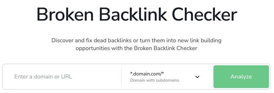
12. Broken Links and Errors
A vital issue with any website is the occurrence of broken links or 404 errors. This not only impacts your user experience but also your SEO metrics.
You can lose indexing on important pages whose links are broken and no longer accessible by search engine crawlers.
If this is a critical page like a landing or pillar page, it can result in strong negative sentiment towards your brand.
Bounce rates will skyrocket and crawl budgets will be wasted on pages with these kinds of errors.
An easy way to ensure that this never happens is to use tools like Screaming Frog that can audit links on your website.
Setting up 301 redirects that can take users away from the deleted pages is also a mandatory step.
Key Takeaways
● Prioritize page loading speed as it is a powerful ranking signal and important for UX.
● Ensure mobile responsiveness is at the top of the docket for your website improvements.
● Simplify your website navigation and ensure breadcrumbs are implemented.
● Strengthen your CTAs with the use of color contrast and compelling language.
● Declutter layouts and ensure consistency with font sizes and spacing throughout the website.
● Highlight social proof like testimonials and brands you've worked with to your users.
● Audit your website with tools like Ahrefs, SEMrush, and Screaming Frog to stay free of errors.